The principles of graphic design are like building blocks. Each one layers on top of the other until you’re left with the foundation for creating something incredible—whether you’re designing a logo, a website, or a custom illustration. If you want the lowdown on all the graphic design basics, you’ve come to the right place because we’re going to cover them all.
Let’s take a look at what you need to know to make all of your designs rock:
Learn the 8 graphic design basics
—
• Space
• Balance
• Hierarchy
• Lines and Shape
• Color
• Typography
• Texture
• Branding
Space
—
You know that peaceful feeling you get when you’re in a gorgeous, wide open space? Well, graphic design works the same way.
The best designs aren’t the ones that try to fit every design element on the block into a single composition. They utilize open space to bring attention to the elements that actually matter.
10 ways to use space more effectively
Space is great—but only when you know how to use it effectively. Read the article above to learn new strategies for taking your use of space and composition to the next level.
The 5 rules of design composition and layout
Utilizing space well comes from knowing the rules of composition. Get to know them (and the other must-know laws of layout) in this article.
Embracing space in interaction design
Interested in UX and interaction design? Learn how to embrace space in digital environments.
Printmaking and the elements of design
What about space on the printed page? We’ve got everything you need to know about the elements of design in printmaking—including how to work with space.
Balance and alignment
—

When it comes to design, you can definitely be creative, but you also have to be balanced. Think of it like this: if you were decorating your living room, you wouldn’t try to squeeze the sofa, the recliner chair, the coffee table, and the end tables all into a tiny corner, right? No, you’d spread the pieces throughout the room to create balance and alignment. With graphic design, it’s exactly the same.
7 principles of design
Proper balance and alignment are core principles of design. Discover how they work and how to use them in concert with other design elements.
The 5 rules of composition and layout
Structure the elements of your composition to create a design that communicates well. These five rules make it simple.
The illusion of movement in graphic design
One of the coolest tricks in the graphic design book? With the right balance, alignment, and composition, you can create designs that look like they’ve been brought to life.
Hierarchy
—
You’ve figured out how to use space and balance. But how do you draw attention to your key elements and make sure your messaging doesn’t get lost in the shuffle?
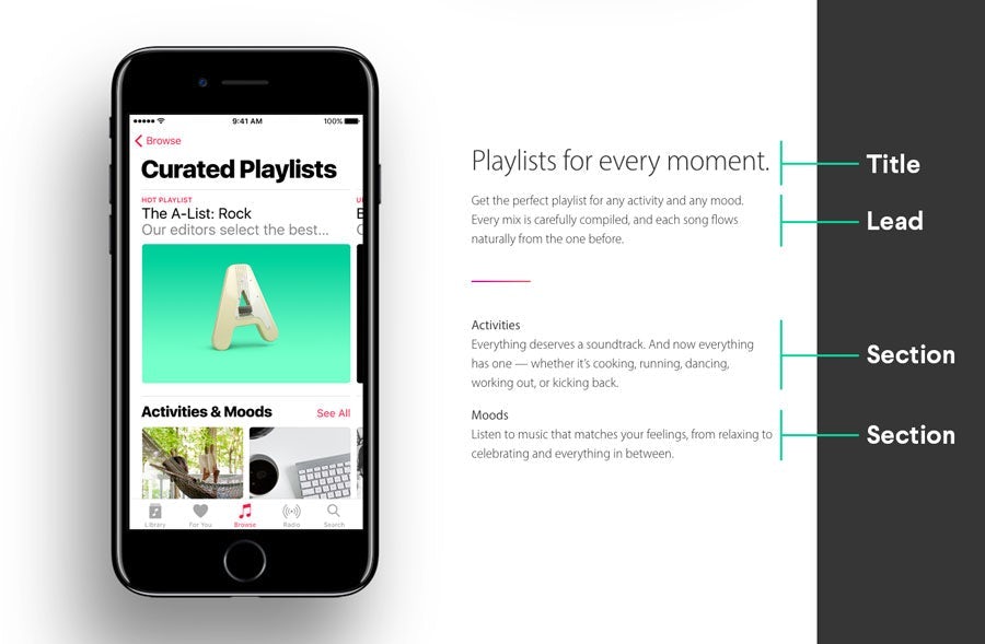
Hierarchy is how you present the elements on your design (whether it’s a brochure, a website or a business card). This directs viewers to where they should focus their attention. As a general rule of thumb, the larger the design element, the more attention-grabbing it will be.
But there’s a lot more to visual hierarchy than “bigger is better.”
The 6 principles of visual hierarchy
This is a great place to get to know the basics of how people view designs and how you can use that behavior to draw attention to your most important design elements.
6 tips for better typographic hierarchy in web design
One of the most vital elements of web design is your messaging. In this article, you’ll wrap your head around the key strategies for leveraging typography to draw attention to your messaging.
Using F and Z patterns to create visual hierarchy in landing page designs
Build your hierarchy around human’s natural eye movement patterns and start driving conversions. Learn more about how people actually see your page and how you can build your hierarchy around it.
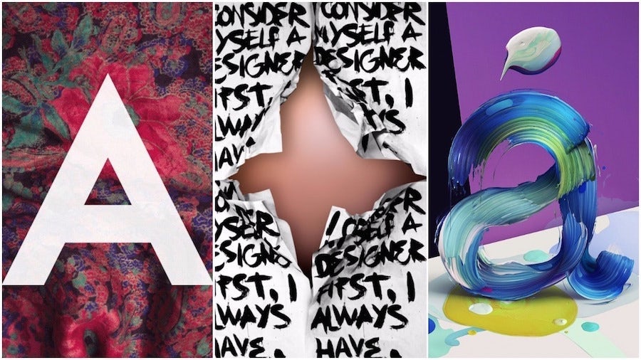
Lines and shapes
—
Lines and shapes form the foundation of your designs, and how you use them can completely transform how a design looks and feels.
For example, a design that’s all rounded edges will send a very different message than a design that embraces sharp lines. Understanding the meaning of lines and shapes is crucial for creating designs that are in-line with your brand, vision and messaging.
The meaning of logo shapes
Your logo is the face of your brand. And the shapes you incorporate into your logo will determine your audience perceives you. In this article, you’ll learn the different meanings behind logo shapes and how to make sure you put your best face forward when creating your own logo.
What is brand identity? And how to design and develop a great one
The lines and shapes you use in your designs are part of an even bigger picture called brand identity. Learn how it works and how to develop a great one.
Color
—
Color is so much more than the rainbow assortment of hues in a bag of Skittles. Color is influence. Color is power. Color drives engagement. But only if you know how to use it.
The colors you choose for your designs are crucial not only to your overall aesthetic, but to how well your designs connect with your audience (which ultimately drives results).
Color meanings and the art of using color psychology
If you want to use color to your advantage, you need to understand how each color affects your audience. Learn more about the psychology of color, the deeper meaning behind each hue, and how to best use color to your advantage.
Branding colors: everything you need to know to choose your brand’s perfect pigments
Different colors drive different results. When you’re choosing colors for your brand color palette, you need to be sure the colors you choose are going to drive the results you want. Get the skinny on choosing the best colors for your brand in this article.
The psychology of color in web design
Without a doubt, one of your most important brand assets is your website. And one of the most important aspects of your web design is color. Discover how to leverage color psychology to choose the best colors for your website.
How to choose the perfect colors for your business card
Your business cards are meant to leave a great first impression with people. Choose the right colors, and they definitely will.
Typography
—
The words you use in your designs are important, but so are the fonts you use to communicate those words.
Typography covers everything from font selection to font layout. Not only does it communicate your core message, but it also communicates a lot about who you are and what you’re about. That’s why it’s important to get it right.
How to use typography principles creatively
You’ve got to understand the basics of typography. But you also need to understand how to use them creatively. Learn more about how to get creative with basic typography principles.
Crash course in typography vocabulary
Need to get up to speed on typography lingo? Check out this crash course and learn the language of typography.
How to choose fonts for your web design
The right fonts will elevate your web design to a more professional level. In this article, you’ll learn how to choose the best fonts for your web design.
How to master responsive typography
A huge chunk of your audience will see your website on a mobile device, which means you need a responsive web design and responsive typography to go with it. Learn how to master responsive typography.
14 typography crimes to stop committing
There are seven deadly sins—but when it comes to typography, there’s a solid 14. Learn what they are (and how to avoid them) in this piece.
Texture
—
Texture is a surefire way to add depth and dimension to your designs, which makes them more visually engaging.
Whether you add an actual 3D element to a printed piece like a business card or create the illusion through design, texture makes your designs even more memorable. But it’s a tricky thing to get right. If you don’t nail the texture, your design may feel busy or overwhelming—and that’s never what you’re going for.
Innovative approaches to texture in graphic design
How do you nail texture in graphic design and use it to add the right amount of depth? Discover the three different types of texture, how they work, and when to use them.
Branding
—
Branding is how you bring your business, products, services and story to life. How do you do that? By leveraging all of the graphic design basics we’ve covered in this guide to build a brand that feels true to who you are.
The importance of bringing branding to life
Start here and learn why it’s important to bring your brand to life (and how to do it) in this article.
How to develop a branding strategy for your business
Branding starts with strategy. If you want to build a brand that tells your story and connects with your audience, you need to plan ahead. In this piece, you’ll learn exactly how to develop a winning strategy for your brand.
Branding vs. brand identity vs. logo: what’s the difference?
Believe it or not, these are not the same thing. Discover the difference between branding, brand identity and logo design.
There’s nothing “basic” about great design.
—
Well, that’s it! Now you’ve got all the resources you need to understand the basics of graphic design. With this solid foundation, all that’s left to do is get out there and use them to build incredible designs that make your brand shine.